

Pod On The Go
Agency
Pioneer Design
Services
Visual Identity
The Challenge
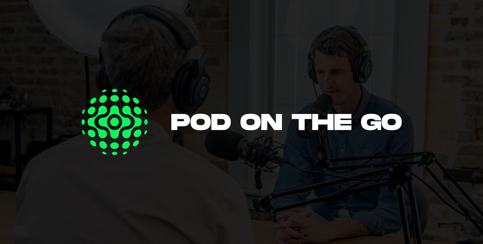
Pod On The Go is an online booking site for energetic podcasters who are looking to level up their production. Pod [On The Go] helps users connect with studio spaces across the world for their recording, mixing, producing, and various other podcast needs. The challenge was that their existing visual branding and tone didn’t match the energy they brought to the market. Their old mark was a combination of stock iconography and a simple typeface. So we (Pioneer Design & I) set out to not only discover core values, their “why”, and strategy, but also present them with a visual solution that fit them and the energy they brought to the space.
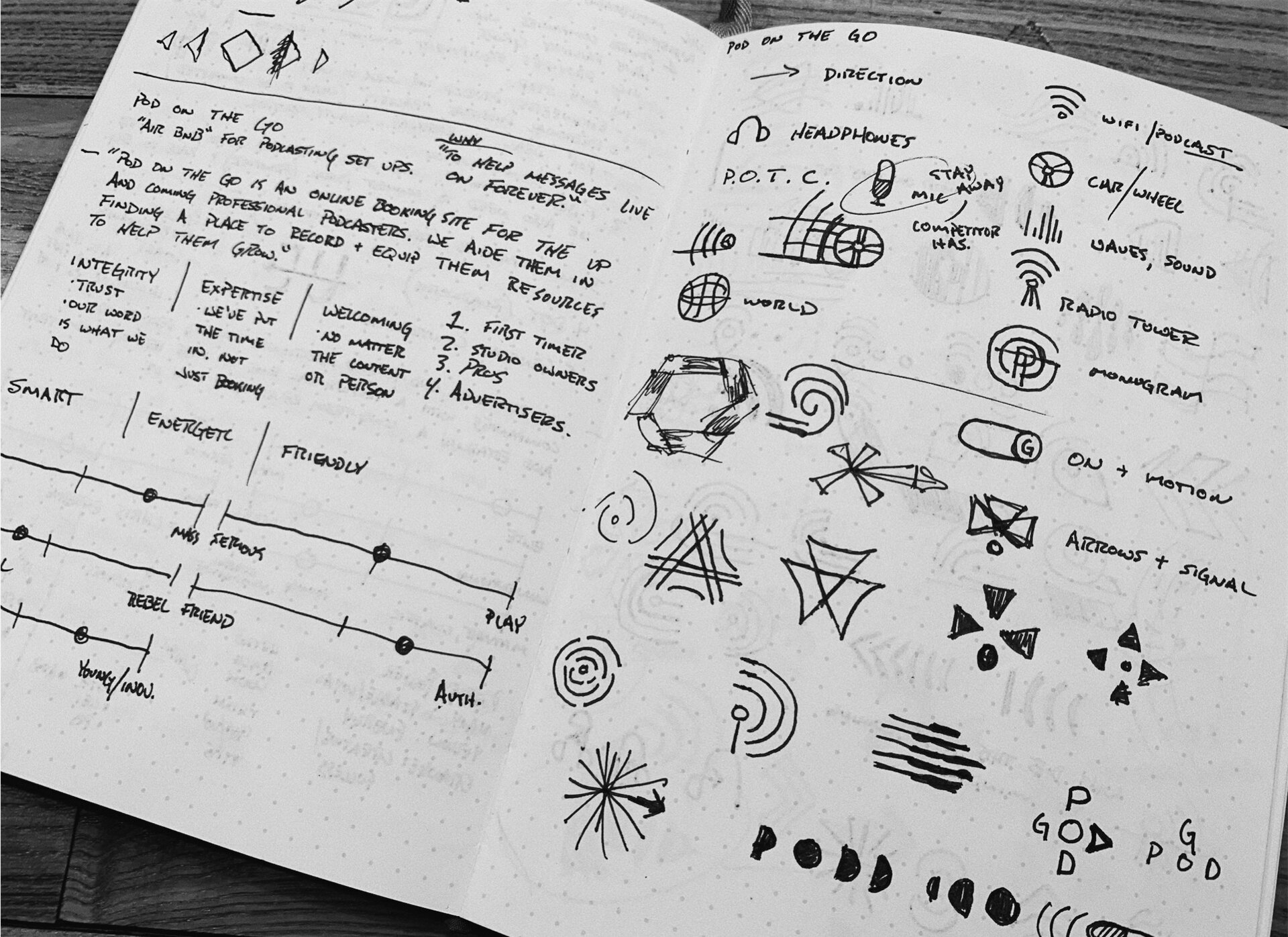

Within the process of developing a mark we wanted something to match the energy and motion of the culture. Something that could be inspirational for those who used Pod to create and also a clever mark that showed who Pod was. Paired with a color palette and type system to match and differentiate from their competition and those in the market. This meant as always, a lot of sketching, ideas, and then fine tuning a direction once we felt good about one.
The Process

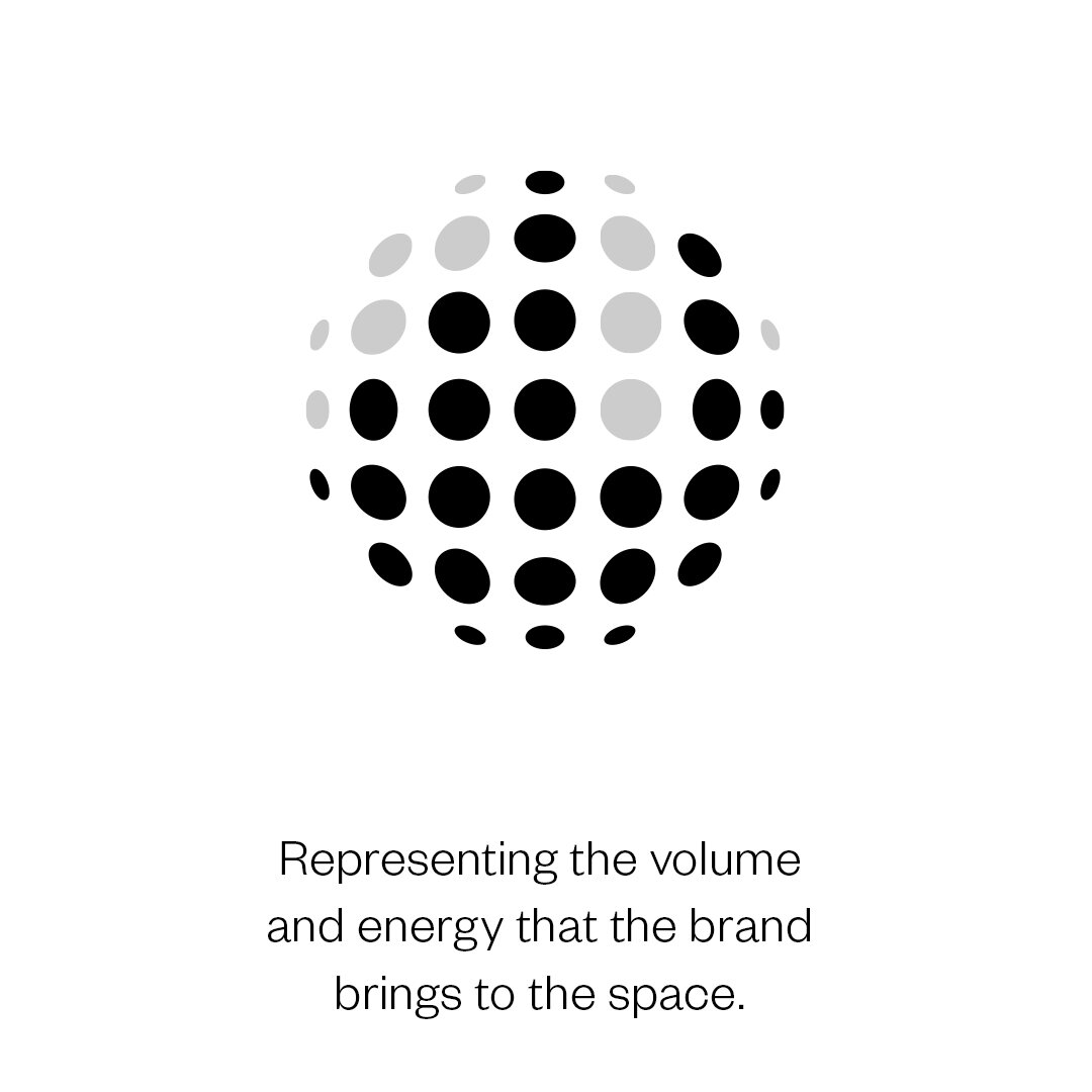
Once we found the shape and concept, fine tuning the details and building in the values and “why” took some time. Especially to find something that conveyed everything in Pod’s story without going over the top. Something that felt natural and balanced and when you’re working with these shapes your eyes go a little crazy after a while.
The “Why”

Once we got that “ah-ha” moment we started to crank out the deliverables with our own renewed energy and passion for a mark that has become a lively piece on it’s own.
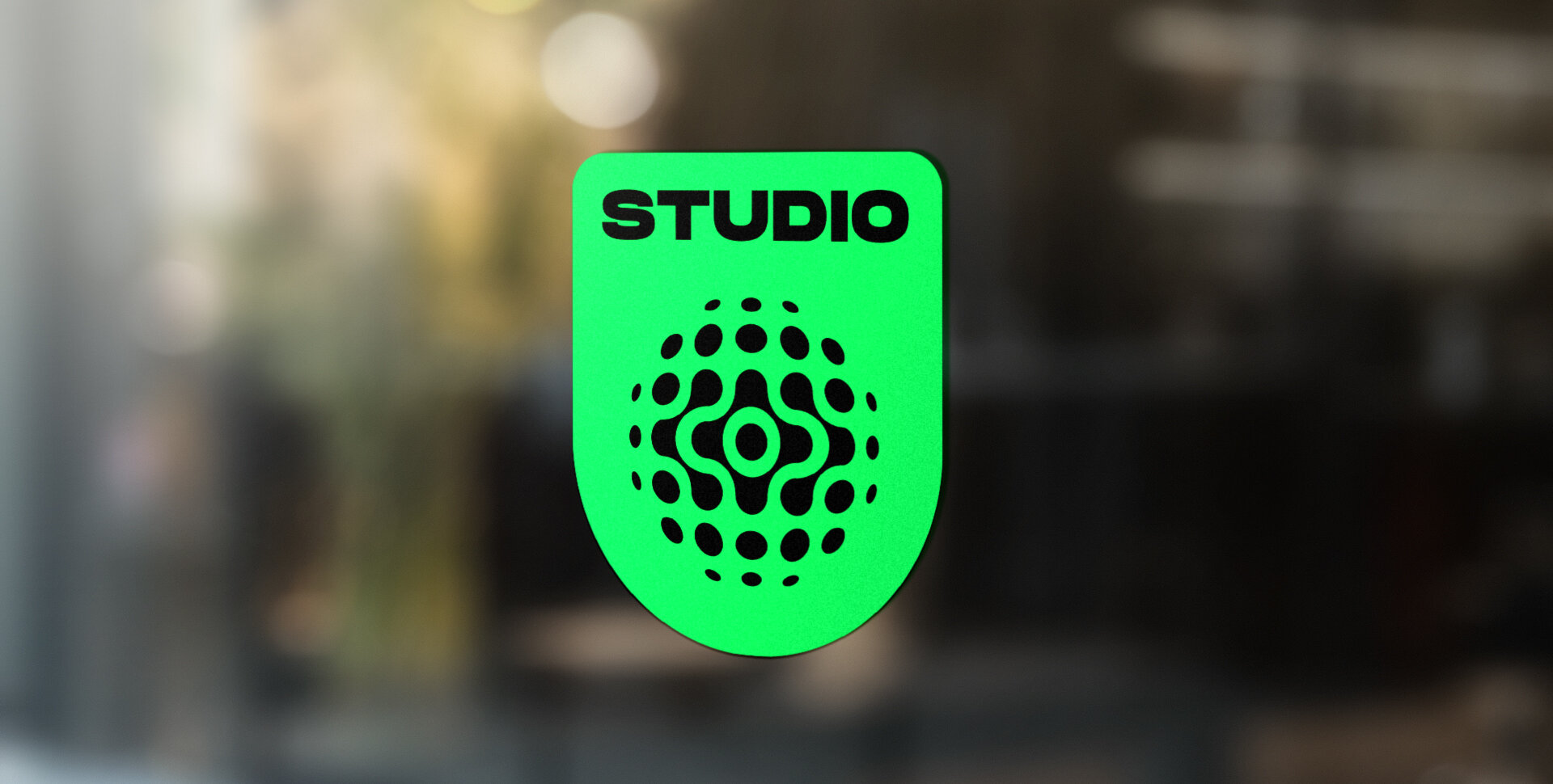
The Solution


Lancaster, PA / eryin@wandeldesign.com / 717.875.6936 / © Wandel Design, Eryin Wandel