Reading United AC
Services
Visual Identity
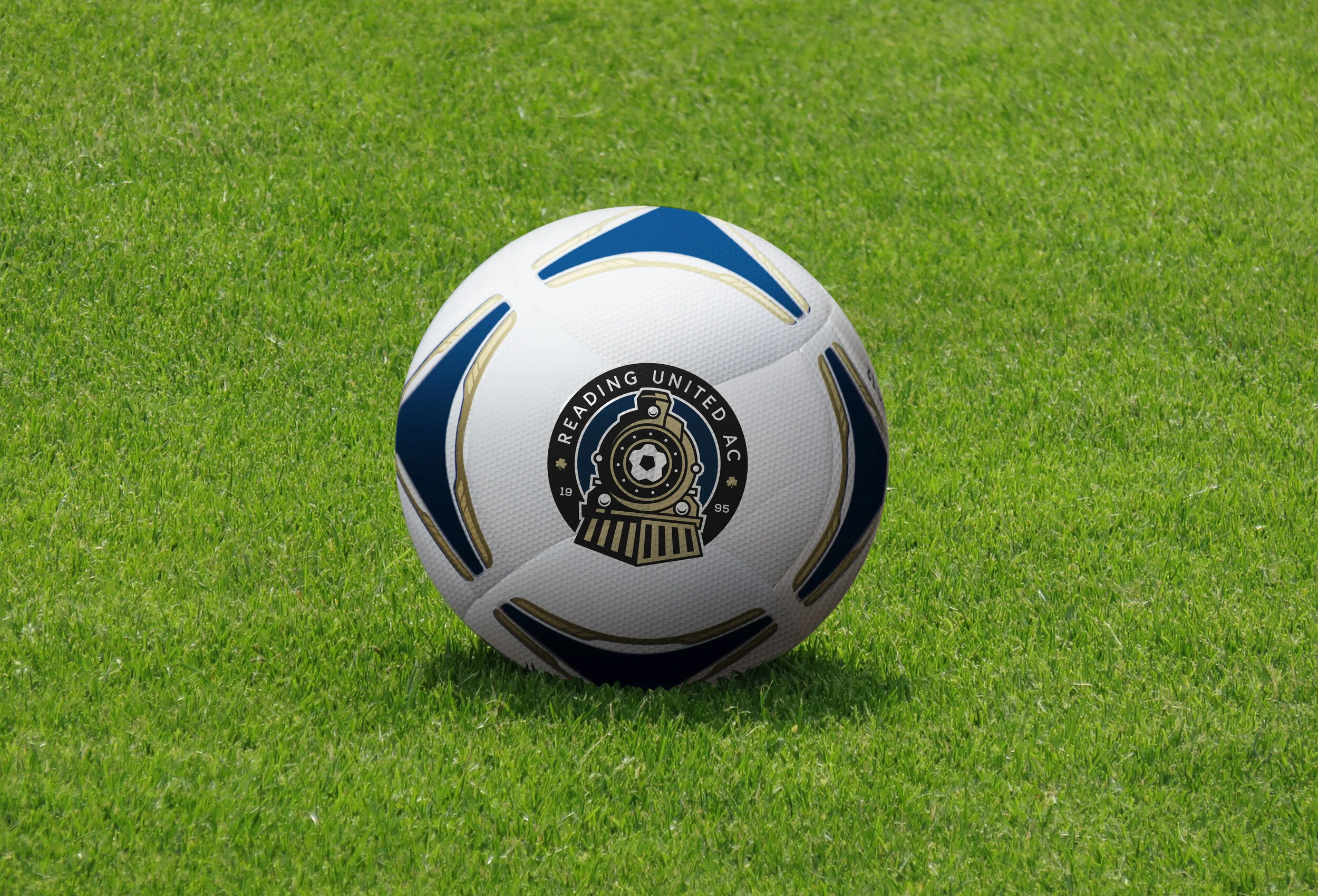
For 25 years Reading United AC has brought high levels of soccer to Reading, Pennsylvania. Providing a launching point for players to sign into the pros in Major League Soccer and various other professional leagues around the world. Before their 25th season the club approached me to clean up the old mark and create something that will propel them into the next 25 while keeping their strong elements of the railroad and clovers that drew representation of founding members. (Also to note, personally I took it as a big challenge as I interned with Reading United in college, so it also felt very much like a personal project as well.)
The Challenge
With a quick turnaround on the plate and the holidays in mind we knew we had to be open to communication as we went into releasing this mark before the 2020 USL League 2 season (which was later canceled to to COVID-19). But we knew that the mark wasn’t going to shift too much and that many of the core elements were staying, which allowed for a clear way forward as we refined the concept.
The Process
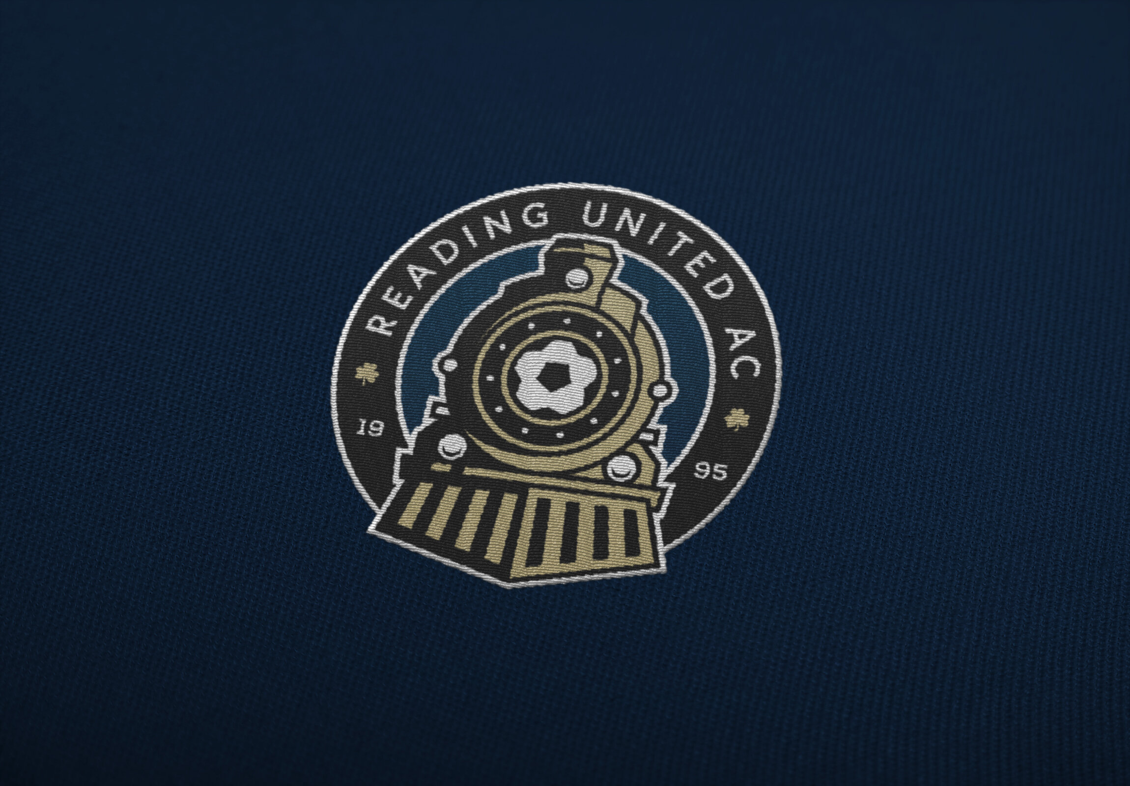
In the end, after a lot of back and forth we rested on a mark that all we were all proud to call Reading United. A mark that was achieved by redrawing the train with stronger and simpler lines, removing the keystone from the main mark to reduce clutter (but keeping it with a secondary), and as mentioned updating the typeface.
Along with the refresh we kept…
- The clovers that pay homage to Paul “Archie” Moylan - former team captain, coach, and general manager.
- The 11 “bolts” around the center ball to represent the 11 players on the field as the train moves forward out of the roundel representing the clubs forward progress as well as each one of those players.
- Correcting the error with the founding date from 2010 to 1995. (As the club was founded in ‘95 and played their first season one year later.)
The Solution
“Our goal was to take the original design and simplify it into a brand that’s instantly recognizable around Reading, Berks County, and beyond. I think that Wandel Design has done a fantastic job filtering our history and future into a clear, concise vision moving forward.”
Lancaster, PA / eryin@wandeldesign.com / 717.875.6936 / © Wandel Design, Eryin Wandel


